FRUSTUM – Design Brand Development
Frustum regards design as a process that reflects the origins and formation of life, including its socio-cultural composition. We can see that design is generally used to form unknownunknown relationships, which is the main intention of our brand.
esign is not just a purposeful activity concerned about the outcome, but the key to greater inspiration and more creative possibilities in our lives. This is the vision pursued by Frustum. It has everything to do with our business philosophy and entire development plan.
Our brand has been designed around the concept of “invisible non-visibility” in order to deepen people’s understanding of the internal essence and external expression of life. This kind of design can strike a chord deep in your heart and inspire you to find the bridge between the reality and the spiritual world. This explains why we consider its “inner architecture” as our “meaningful path.”

LOGO CONCEPT AND DEVELOPMENT
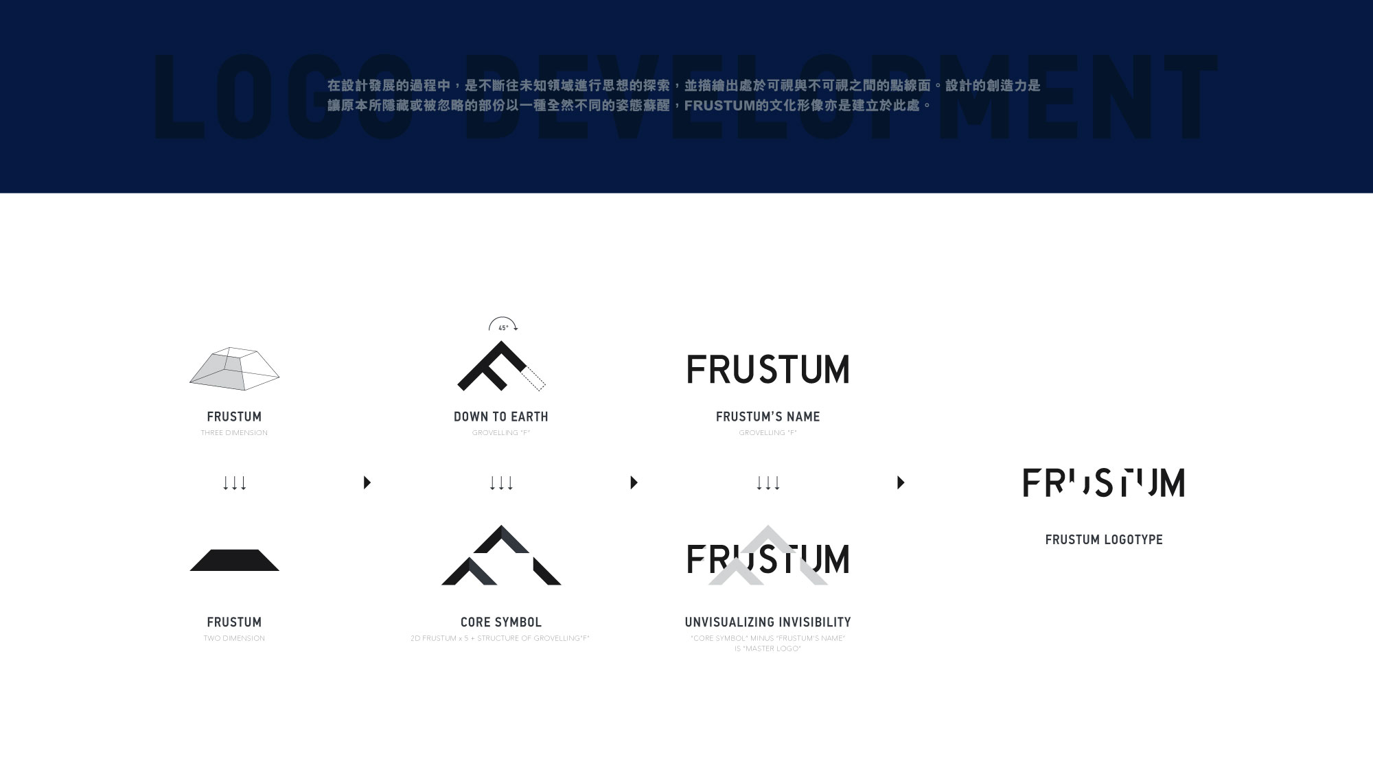
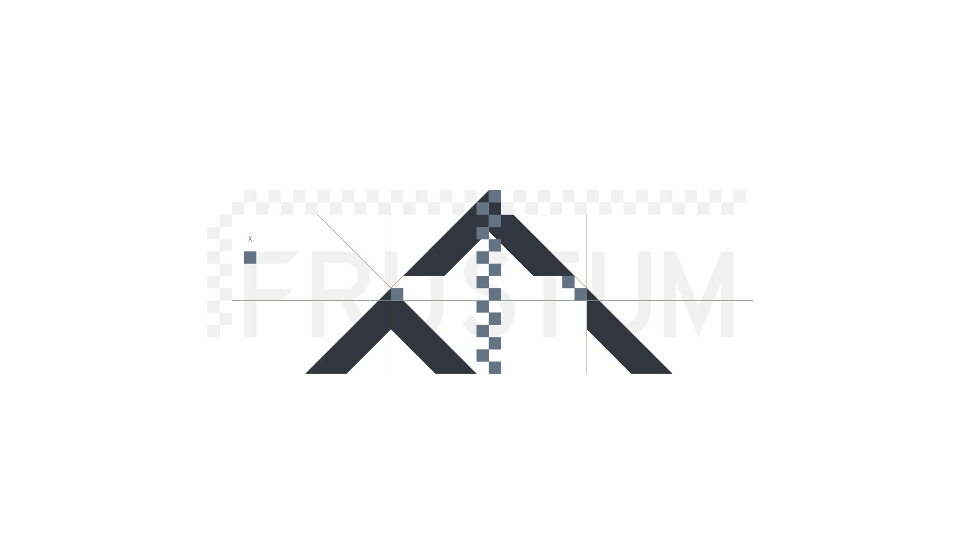
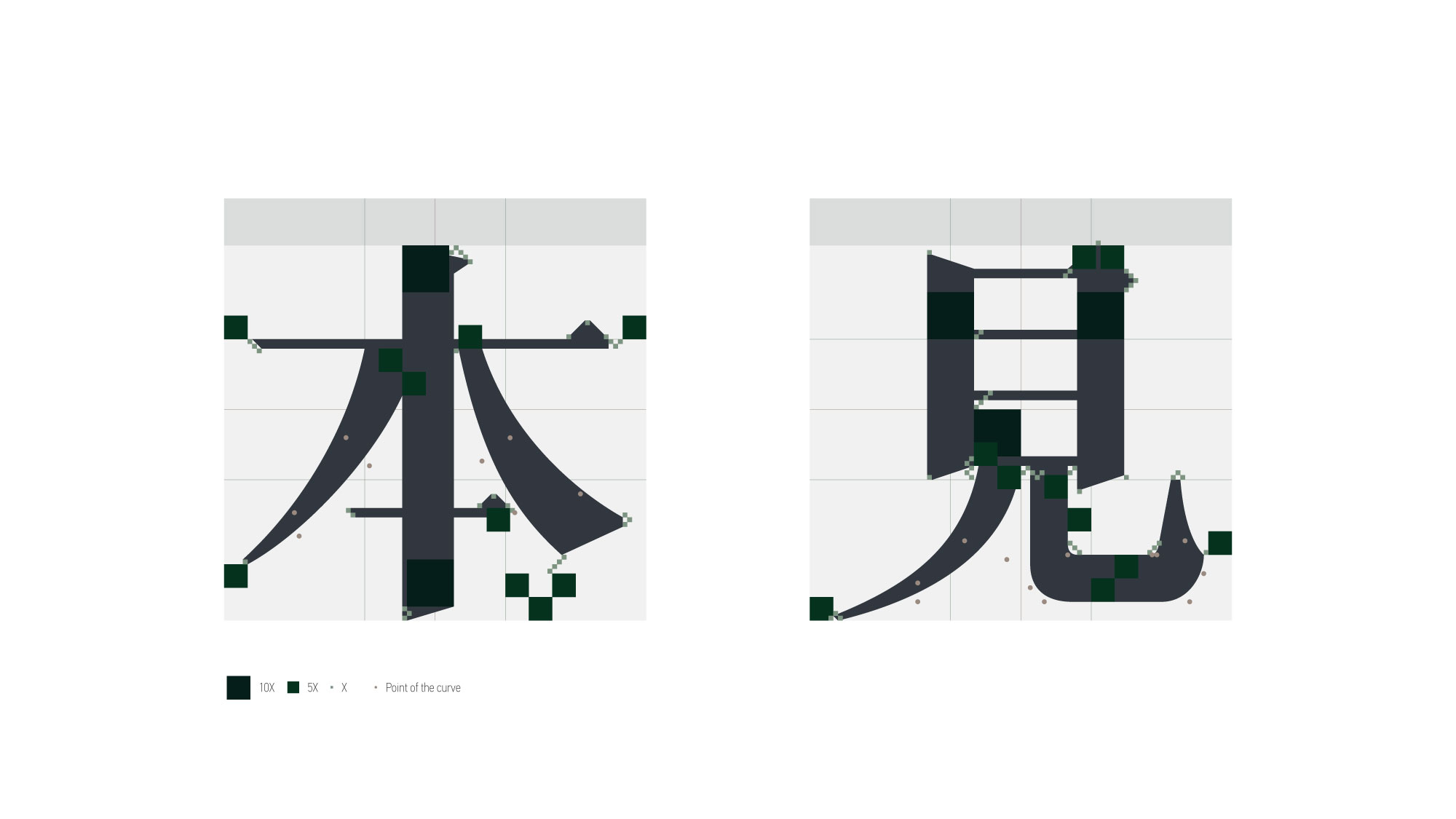
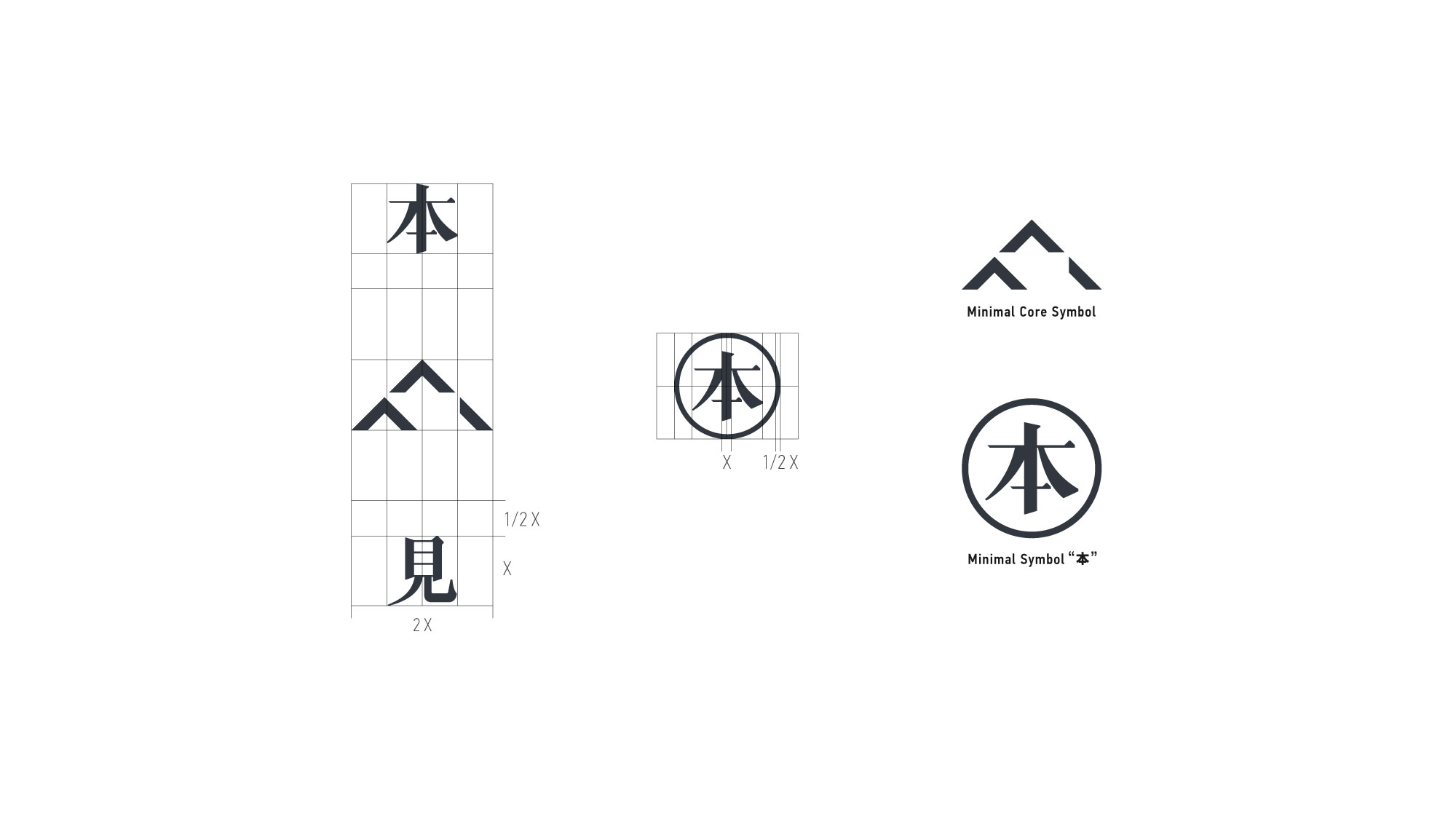
The design process is an approach to exploring the unknown in order to draw a line between the visible and invisible. The creation of design isn’t about making something new, but a reflection on our life and how to awaken to it in a different way.

COLOR SCHEME
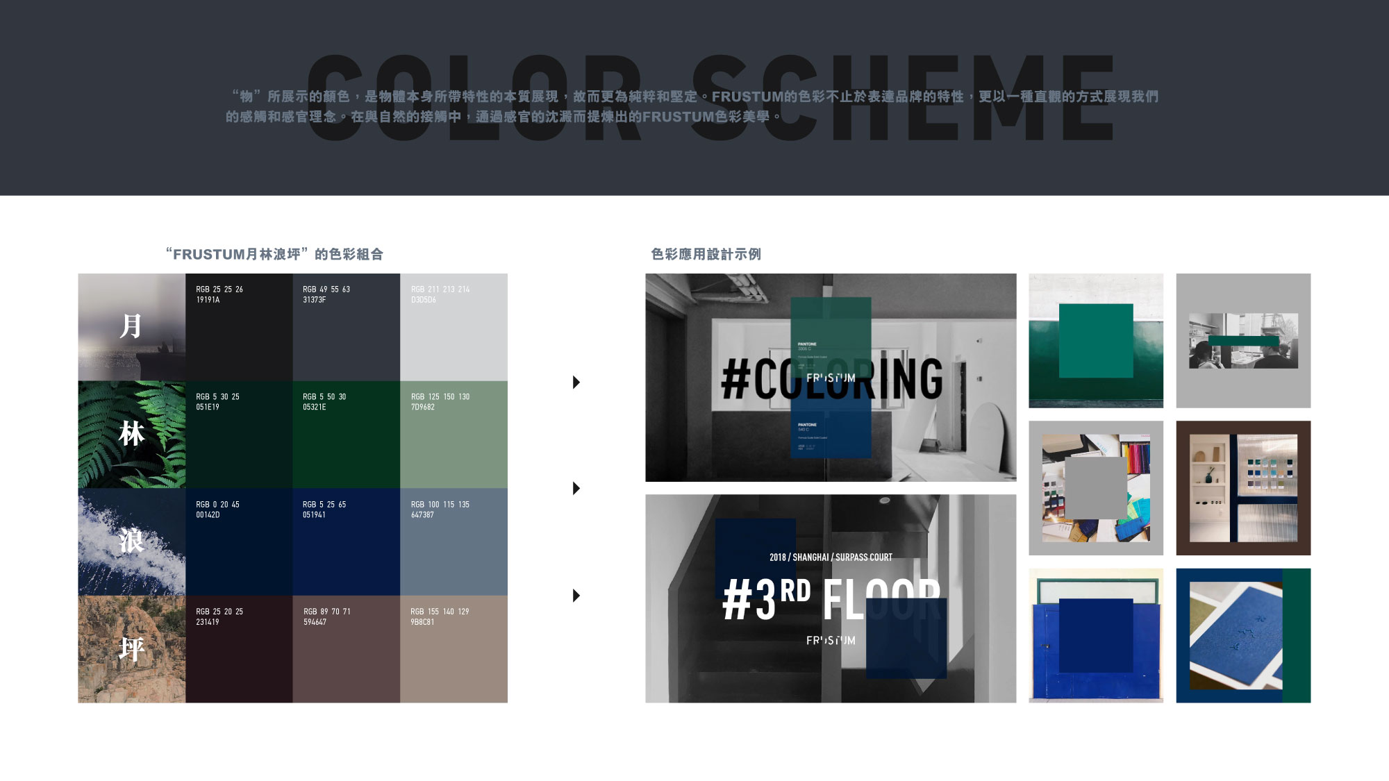
An object’s colour is a direct representation of the characteristics of the object itself. Frustum’s brand colour has evolved from the sensual and subliminal influence of our connection with nature and all of life. It doesn’t only tell the story of our brand, but more importantly, expresses our senses and moods as a philosophy of colour.
TYPOGRAPHY
Text is used to deliver cognition as well as information, while fonts speak for word itself: the typography communicates profoundly through the integration of experience and understanding. Design works as a medium to represent the interaction between the people and the object. And both the font application, as well as the development of Frustum’s font, speak to the aesthetics and utility of the text.

APPLICATION DESIGN
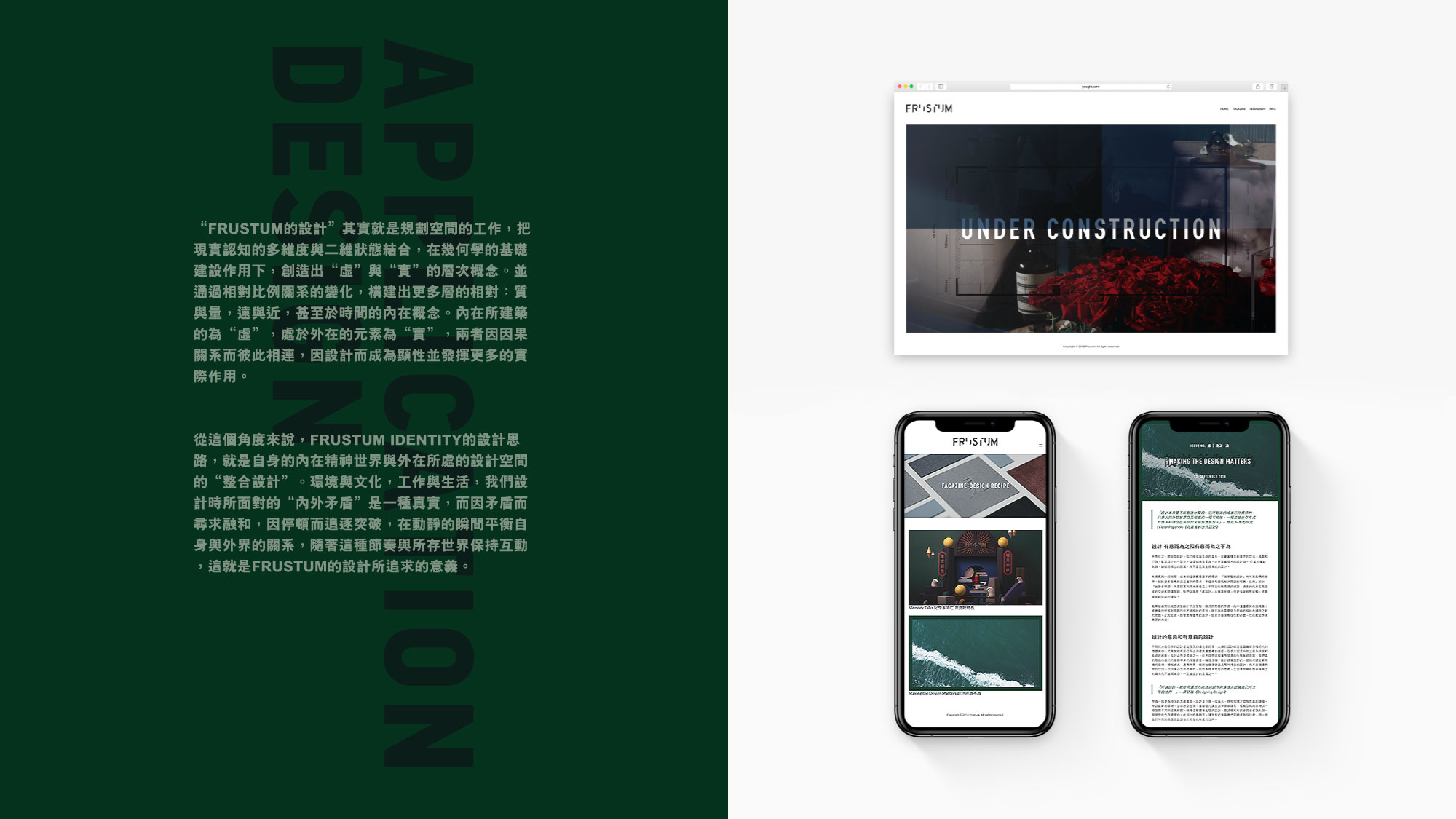
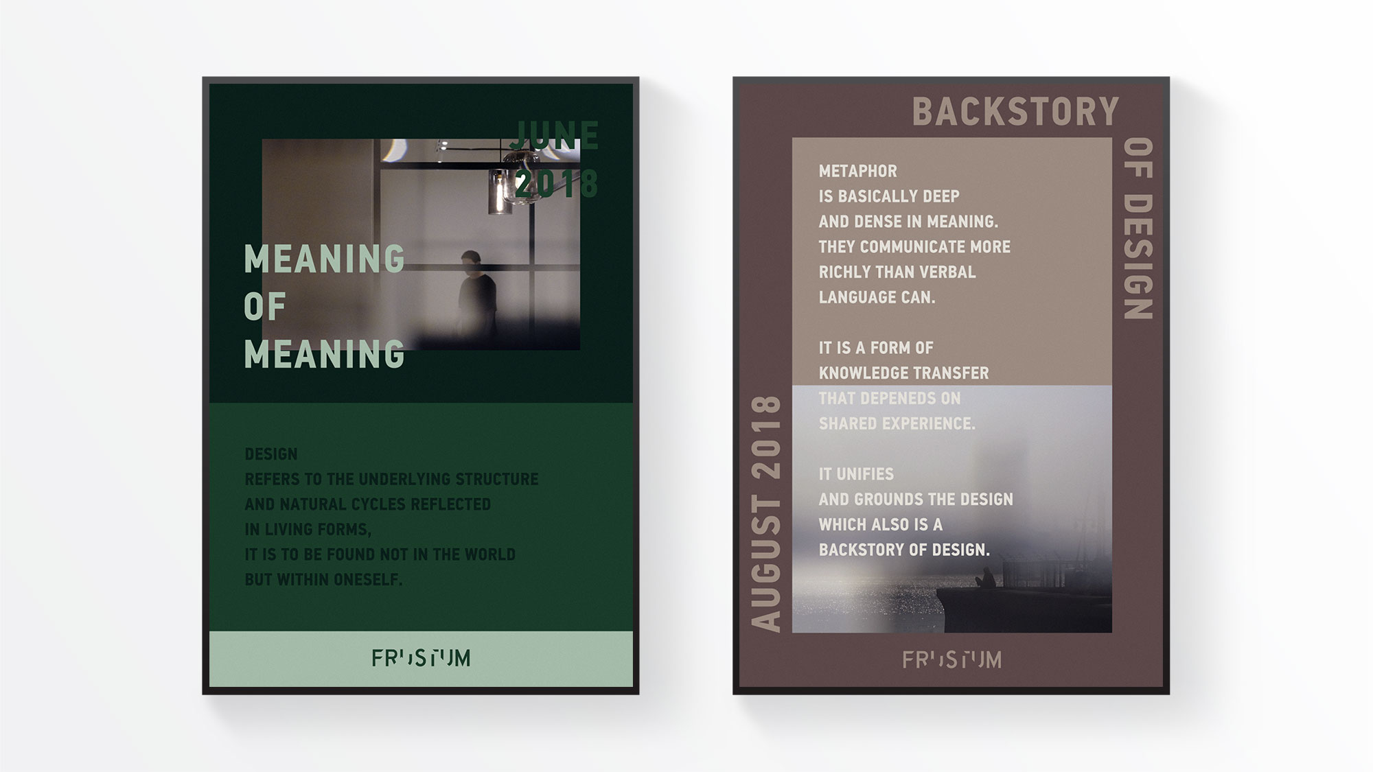
The application of design is the evolution of an architectural concept combining a cognition of reality with a 2D structural world that includes what is solid as well as what is absent, or void. In this structure, the tension between these relative concepts will create more layers according to the change of proportionality: quality and quantity, time and space, existence and emptyness, etc. In this way, the application design is like a spatial design that generates other substructural connections, where depiction imbues them with vitality.
Environment and culture, life and work, and the “internal and external contradictions” in front of us are the source of our design. The contradictions to harmony, the pauses with breakthroughs, and the various rhythms prompt us to find a balance through our interactions with the world, and this is what FRUSTUM design pursues.


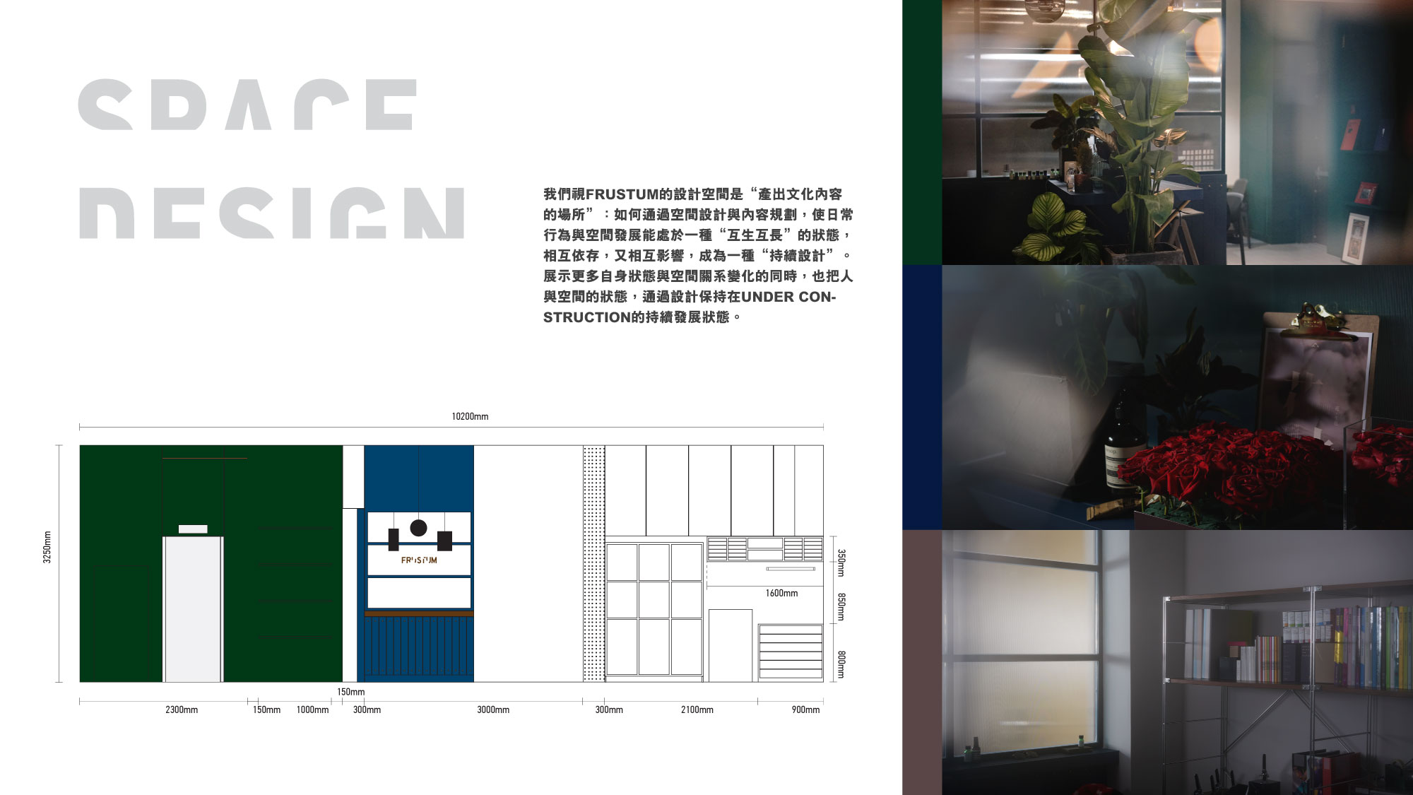
FRUSTUM SPACE DESIGN
To make our interior design environmentally sustainable, we define Frustum design space as a culture content creating space, where our daily behavior and the space development function as two pillars, and their mutual influence not only enriches the “language of space”, but also benefits designers’ products. This maintains the connection between people and space in dynamic ways, while their relationship exists in a state of “UNDEER CONSTRCTION” because of our spatial design.
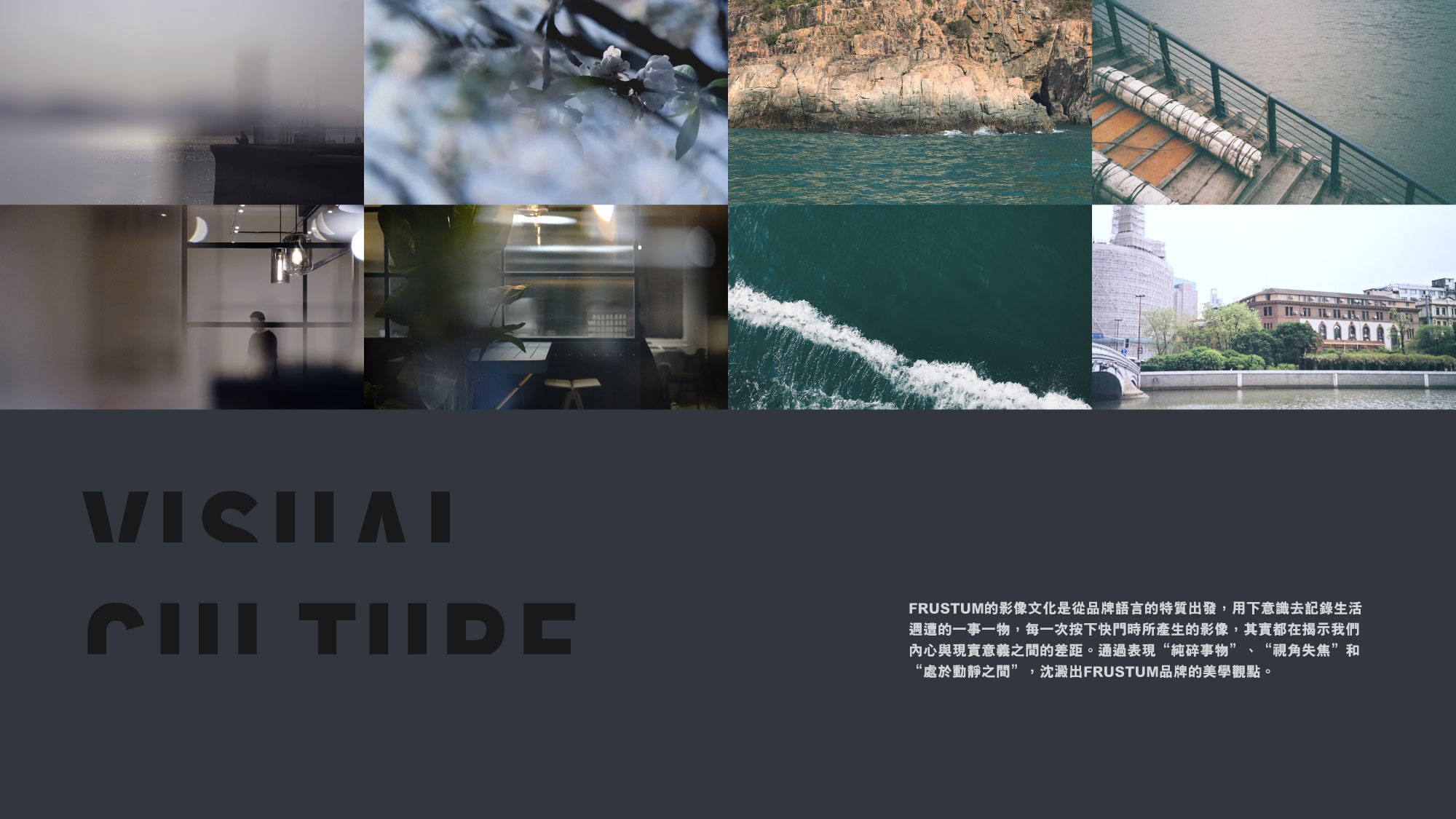
VISUAL CULTURE
FRUSTUM’s visual culture is based on the characteristics of brand language. We record life with our subconsciousness instead of thought. When you open or close the shutter, you play with the gap between interior and exterior reality. “The True Image,” “Out of Focus,” and “Between Movement” are three parts of a visual story that paints a picture of FRUSTUM’s aesthetic theory.


Leave a Reply
You must be logged in to post a comment.