GE Healthcare Join Pink 2024 Campaign - VI Design, Exhibition Design & Curation
For 2024, the Join Pink campaign focus to transforming individual experiences—patients, healthcare workers, and doctors—into shared public resources. This approach fosters a dynamic exchange of empathy, information, and knowledge, creating a network of mutual understanding. By amplifying diverse voices, the campaign supports a more empathetic and sustainable healthcare model that prioritizes prevention and early intervention. This not only empowers individuals but also raises societal awareness, encouraging more efficient use of medical resources.With this year’s theme, LINK, the creative strategy emphasizes interconnectedness and synergy. It brings together doctors, patients, researchers, and communities in a unified visual narrative, redefining breast cancer as a collective experience, not an isolated battle.
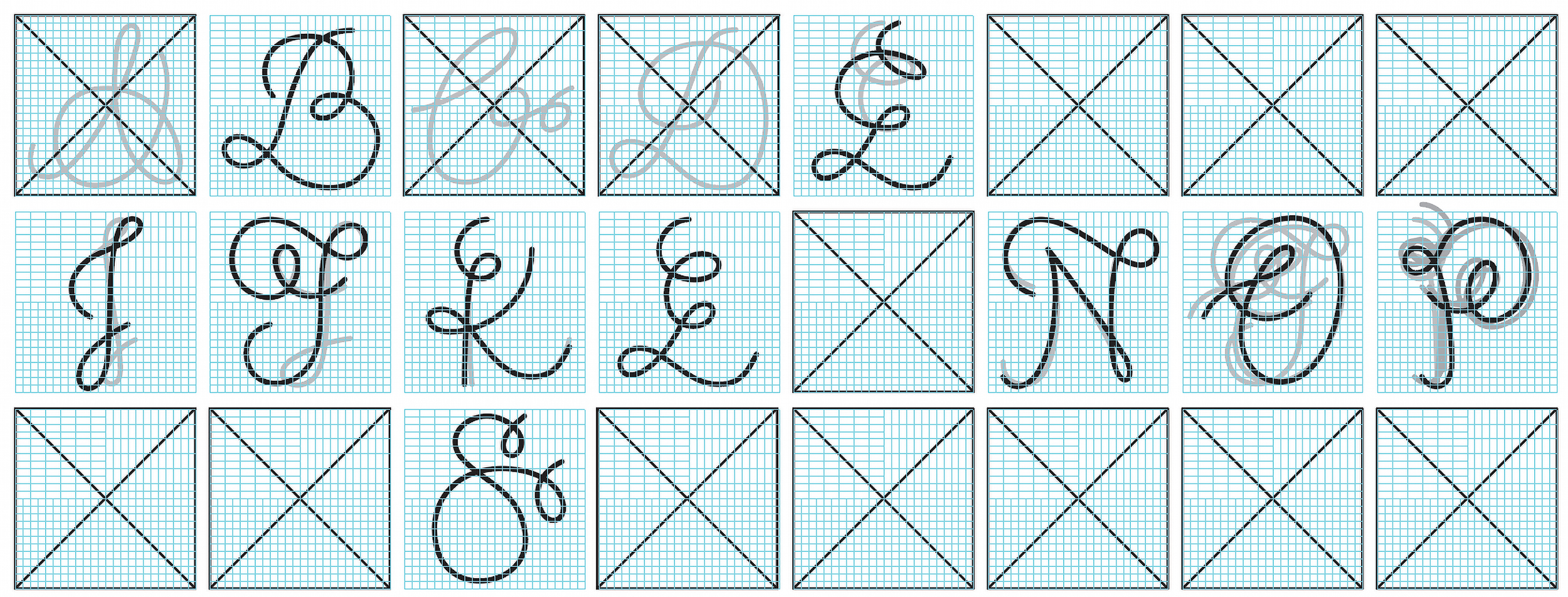
Building on the LINK typeface introduced in 2023, we reimagined each letterform by refining its structure and rotation. This created a dynamic system where each letter transforms into an alternate ampersand (&) when viewed from specific angles. This evolution reinforces the core theme of interconnectedness—the “and” that links two entities—symbolizing the variety of relationships and perspectives the LINK concept embodies.The resulting typeface is fluid and adaptable, where each letter retains its individual meaning while suggesting a deeper, interconnected existence. This synergy between form and function reflects the idea that connections evolve and shift depending on context.Through this typographic transformation, we highlight the power of connection, reinforcing the campaign’s narrative: through unity and collaboration, new meanings and possibilities emerge. The LINK typeface is more than just a visual element; it represents dynamic relationships that foster understanding and engagement.
London & Shanghai | Curating by Emma Wang
Creative Direction by Chester Lau
Art Direction & Graphic Design by Yoyo Yau, Chester Lau, Emma Wang
Editing & Content Creation by Emma Wang
Project Managment by Emma Wang
Communication & Project Managment by Ivy Hsieh
Exhibition Design by Frustum Design London & Shanghai
Art Coordination by Frustum Design Gallery
Typographic Consultation by Typeunit
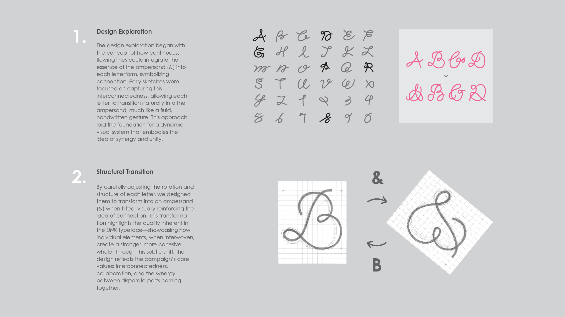
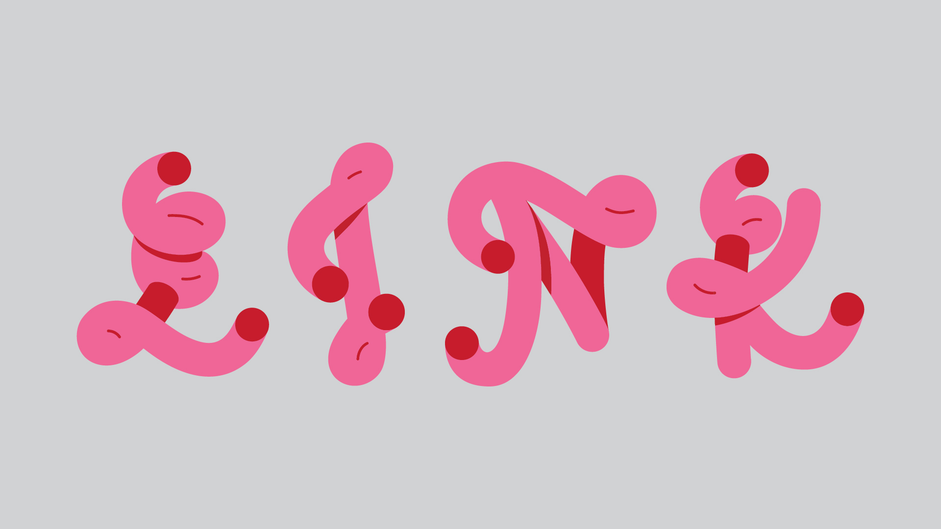
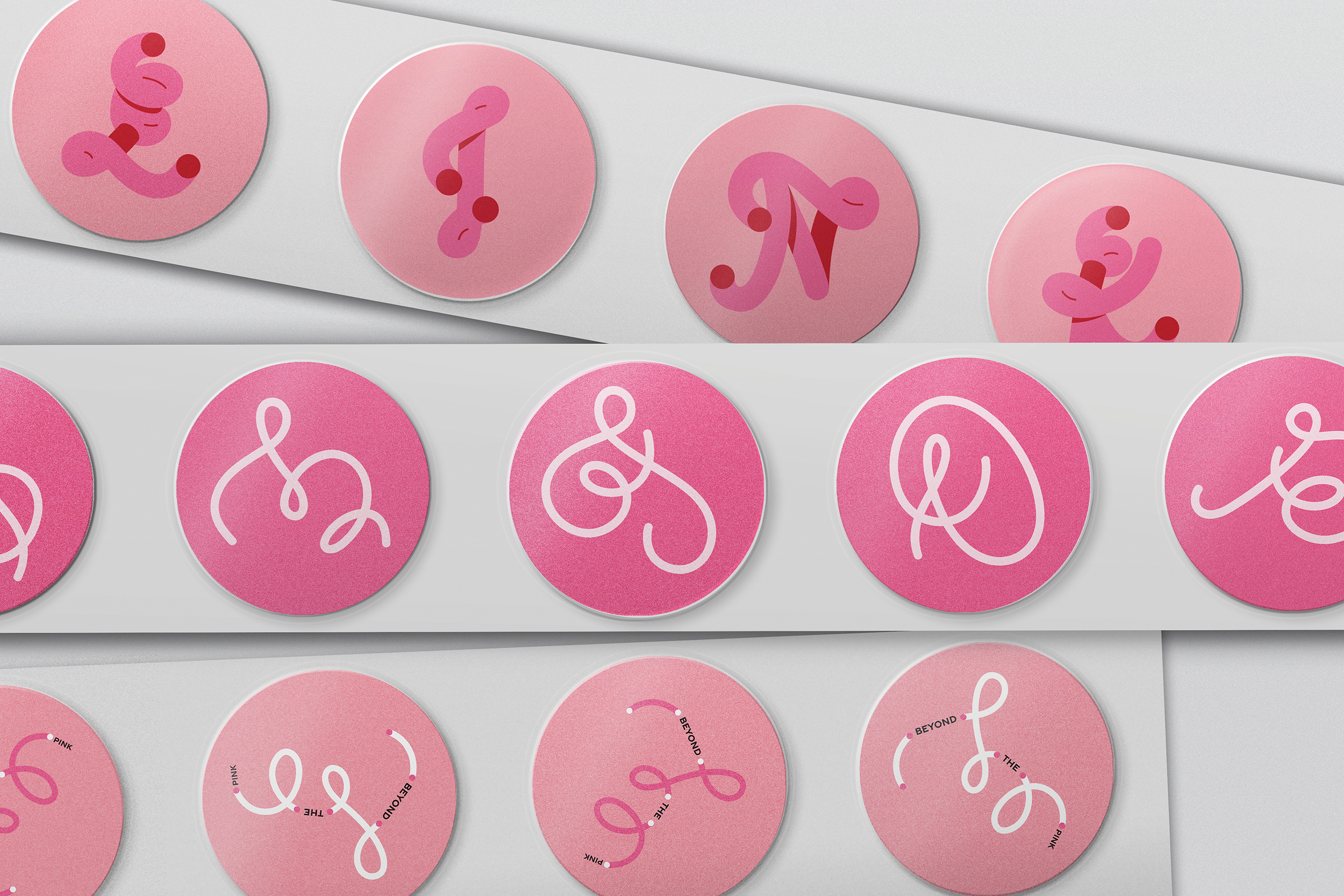
Letterform Crafting: Embodying “LINK"
In developing the visual language for the Join Pink campaign, we began by selecting a set of letterforms derived from the most frequently used characters across the campaign’s materials. Special focus was given to the four key letters—L, I, N, and K—each symbolizing the essence of the campaign’s core theme: Link.
Each letter was thoughtfully crafted to seamlessly transition into an alternate ampersand (&) form when viewed from specific angles. This fluid, transformative design approach reflects the concept of connection, where each letter becomes part of a dynamic and ever-evolving network. By aligning the letterforms with the theme of Link, we created a cohesive, interactive visual system that emphasizes the interconnectedness of ideas, people, and communities, reinforcing the campaign’s message of unity and collaboration.
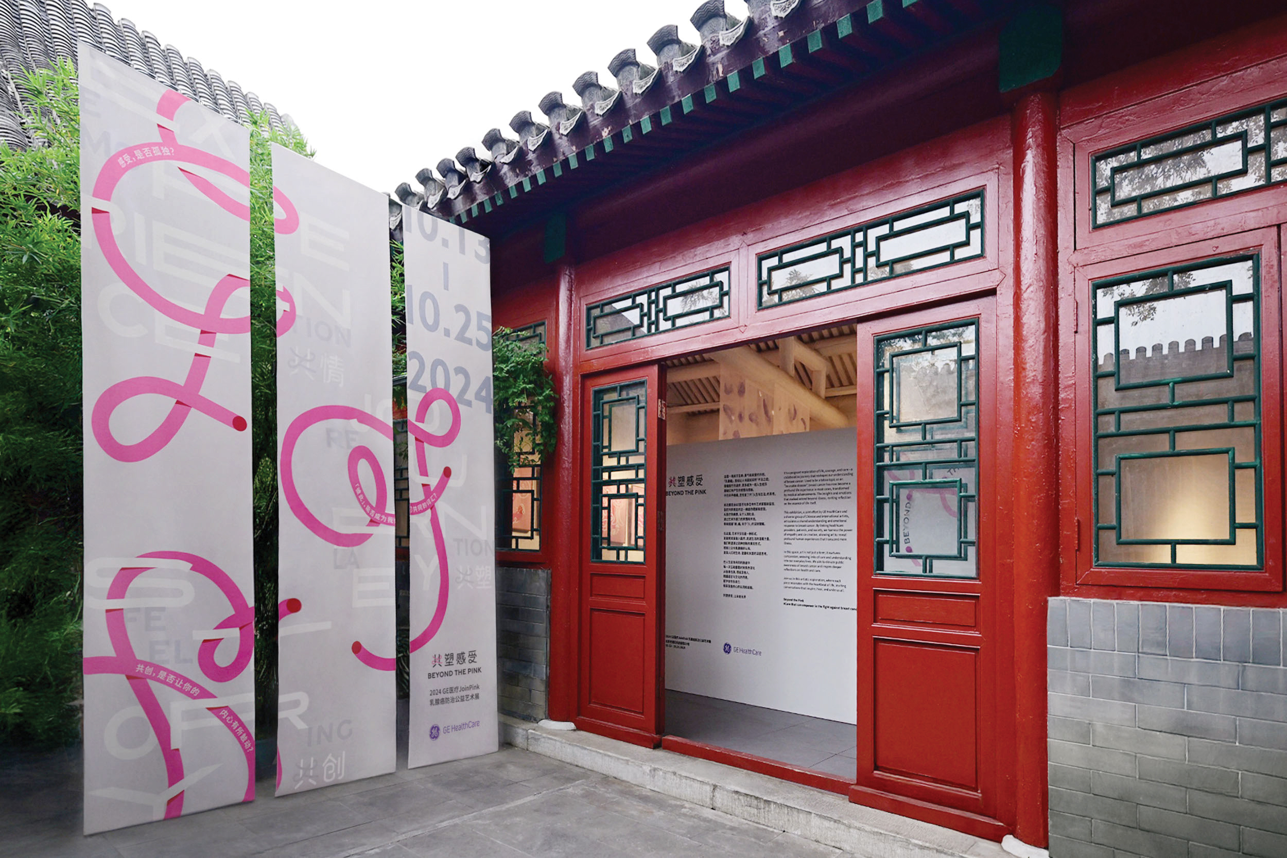
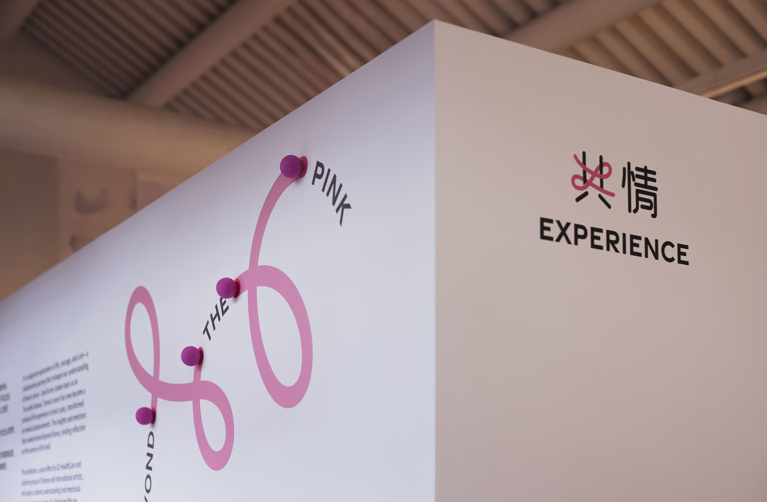
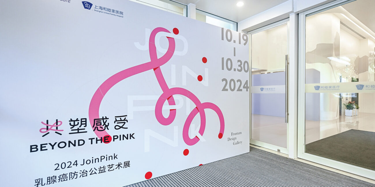
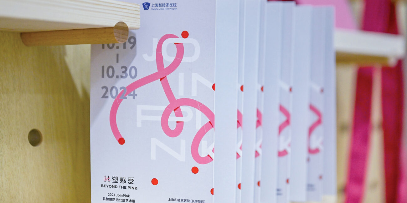
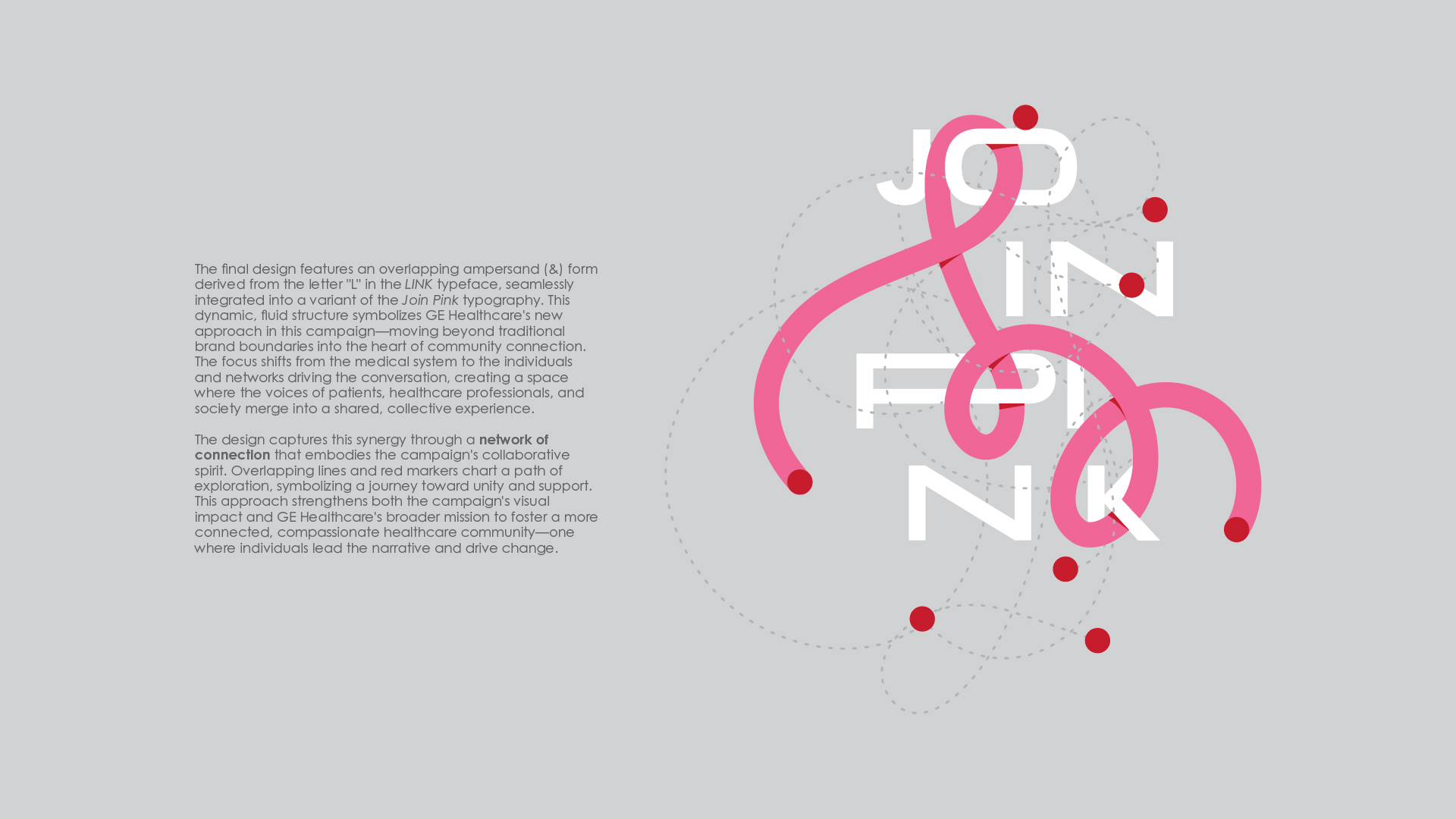
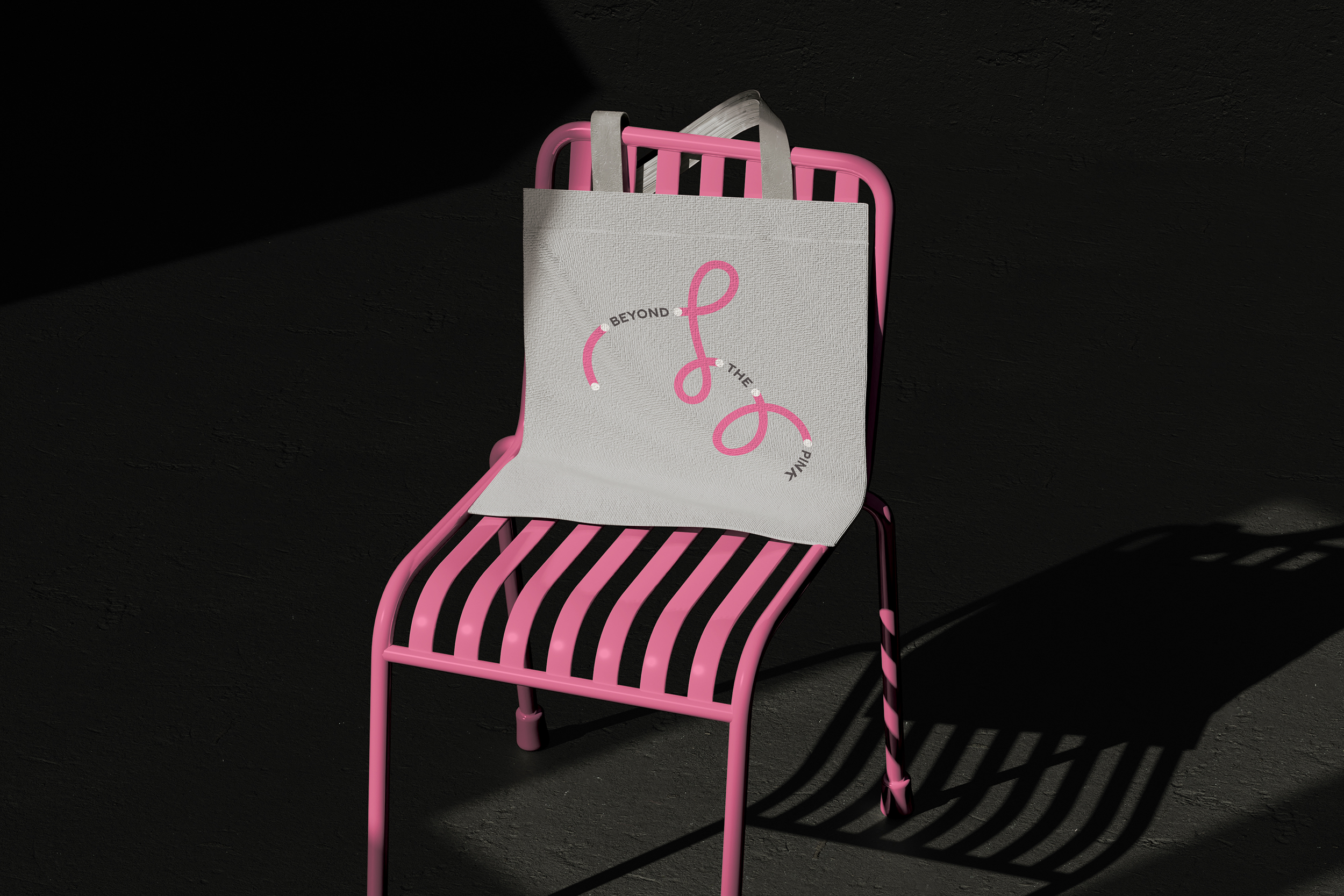
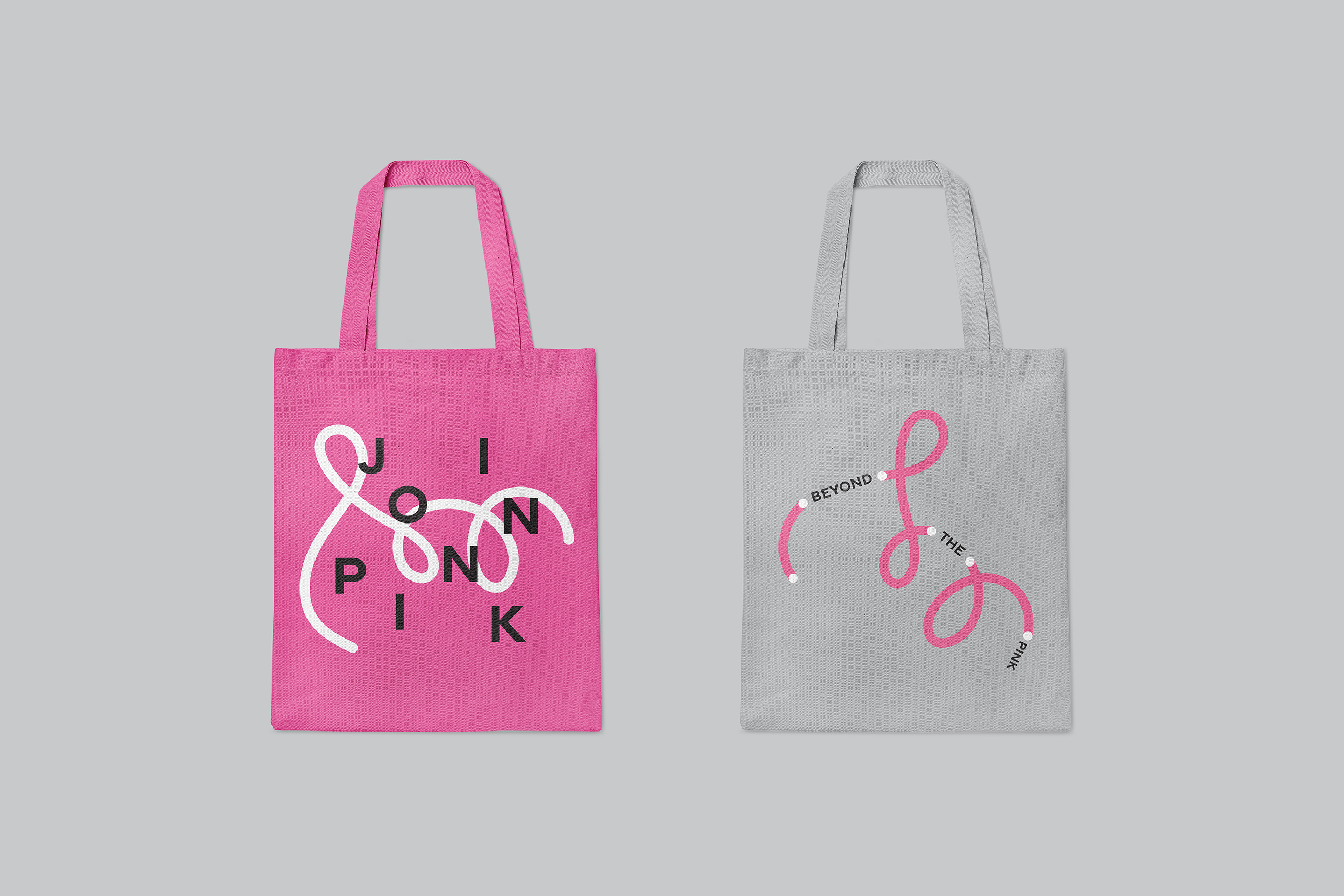
The Join Pink logo is grounded in the concept of "LINK", which serves as both a visual and symbolic foundation. At the core of the logo, the letter "L" from the LINK typeface has been reimagined into an ampersand (&)-like shape, representing unity and connection. The ampersand acts as the central visual element, symbolizing collaboration, partnership, and the convergence of human experience, knowledge, and emotion. The fluidity of the letterforms reflects the evolving nature of connections, highlighting the campaign’s values of empathy, unity, and adaptability.
A simplified version of this flowing motif is also integrated into the Chinese character "共" (meaning "together"), reinforcing the relationship between the English and Chinese elements of the logo. This addition strengthens the idea of a shared, collective experience and bridges cultural and linguistic boundaries.
The Join Pink logo turns the abstract idea of connection into a clear symbol. The transition from letterforms to the ampersand shows how different elements—people, ideas, or experiences—can unite to form a stronger whole. The logo reflects the campaign’s mission to raise awareness and encourage collaboration around breast cancer care and prevention.
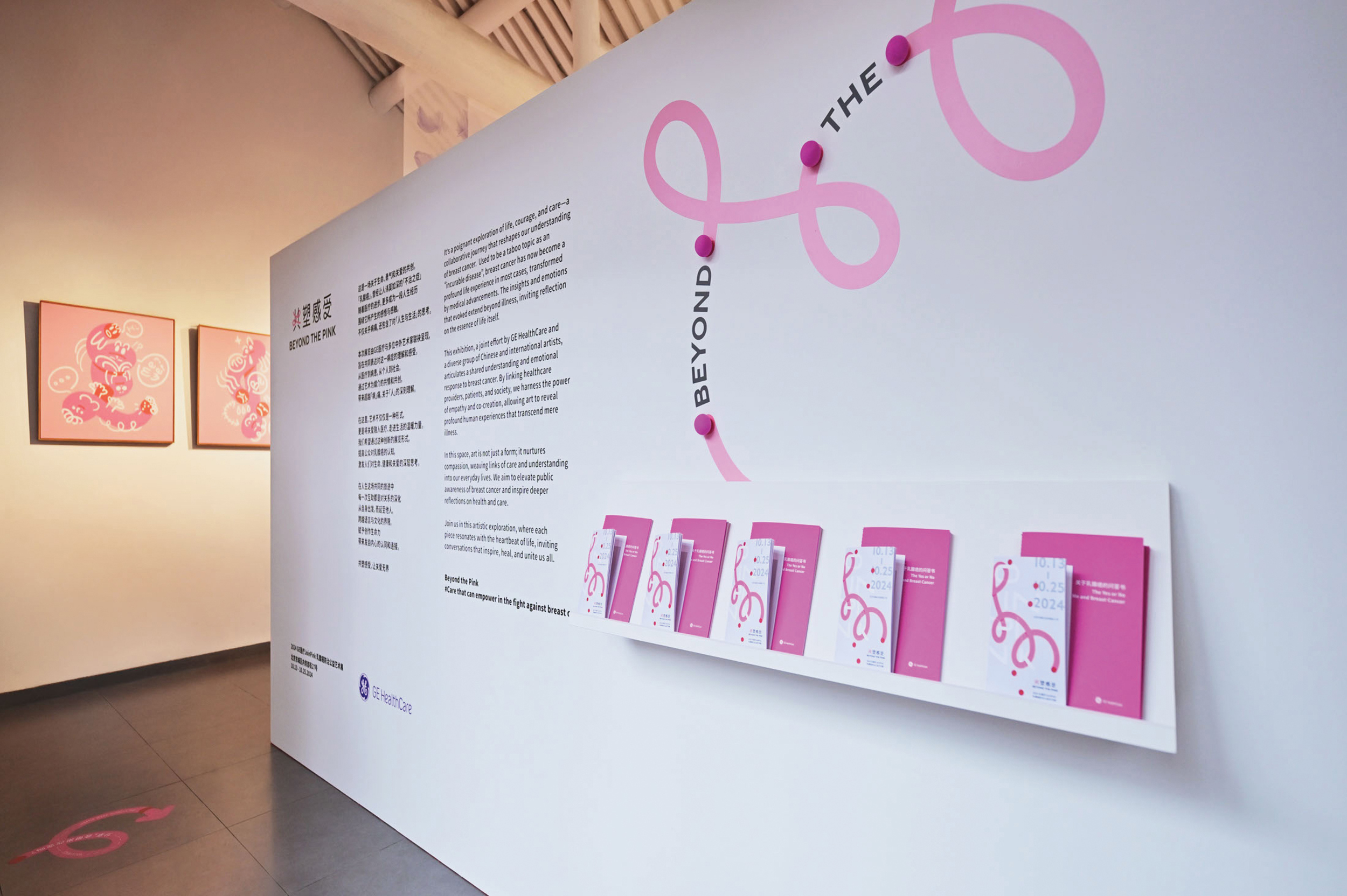
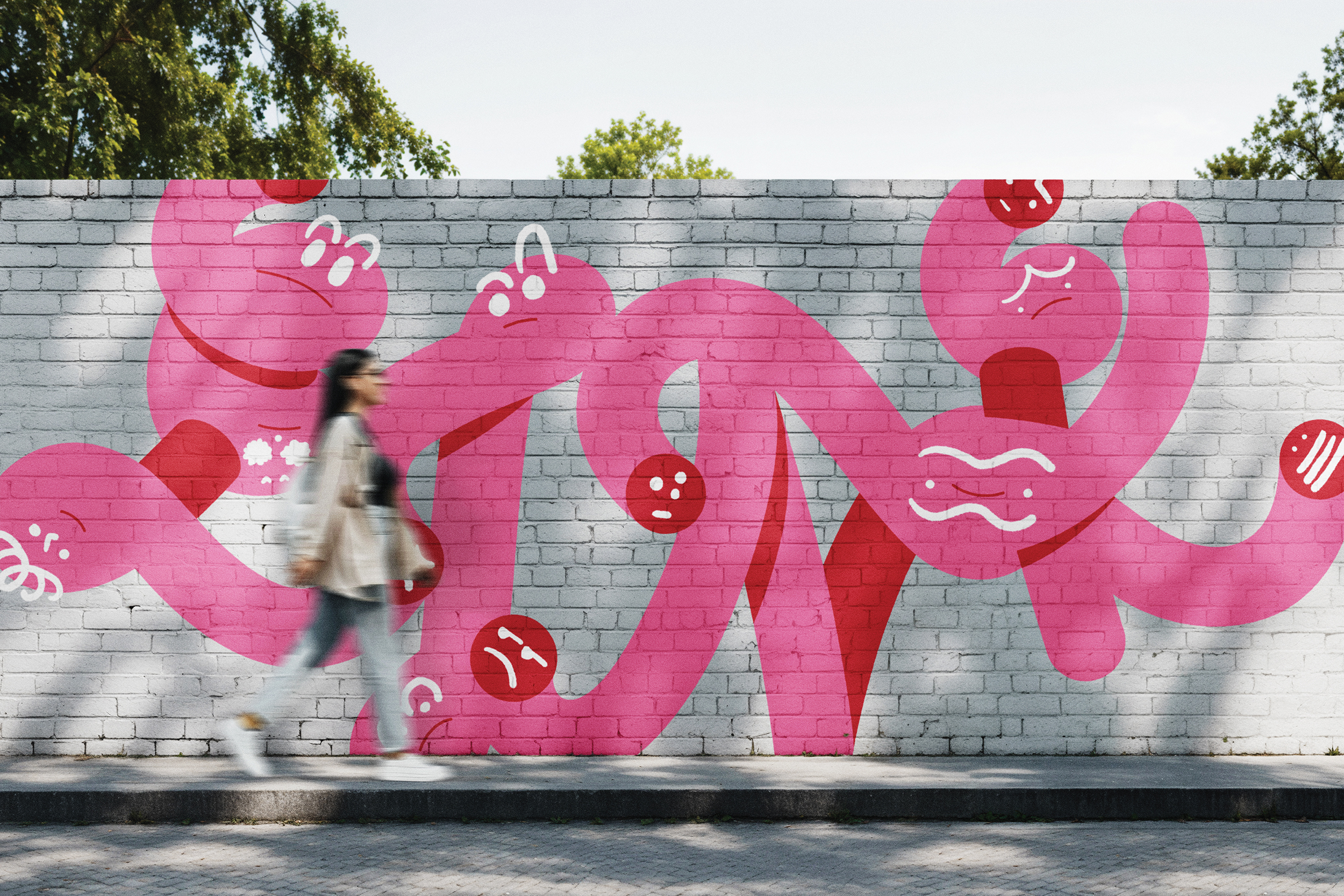
The LINK typographic illustration takes inspiration from the ampersand (&) form within the LINK typeface. This form is reimagined to represent a deeper connection, evolving from a simple line motif into a dynamic symbol with life and emotion. By integrating red and pink fluid lines, the design embodies the flow of connections—like veins or lifeblood—symbolizing the intertwining relationships between individuals, communities, and healthcare. The design is more than just a visual element; it transforms into a character-like form that signifies the narrative of shared experience and unity.For the Join Pink campaign, this version of the LINK typeface will be used across promotional materials and digital assets. Its fluid, interconnected design reinforces the campaign’s message: breast cancer is a shared, collective experience.
By incorporating this expressive typographic form, the design amplifies themes of collaboration, empathy, and interconnectedness. It evolves beyond a logo to become a visual narrative that invites emotional connection and encourages active involvement in the campaign’s mission.
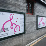
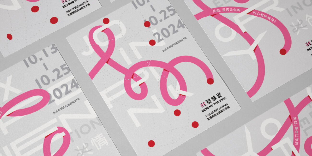
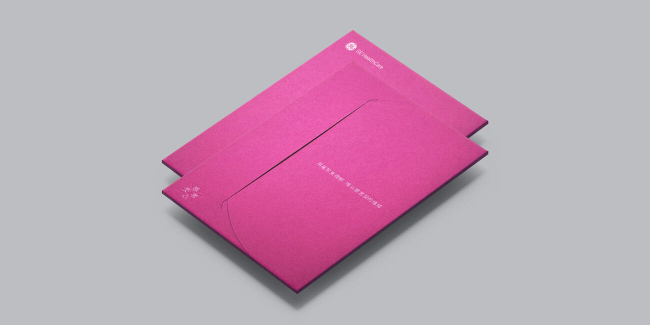
The VI Design is achieved by incorporating subtle details. We have expanded the use of the pink colour and these graphics to create a collection of design items, including exhibition graphics for the exhibition, promotional materials, and more. These collections have been showcased as a fresh concept of the Join Pink Lifestyle.
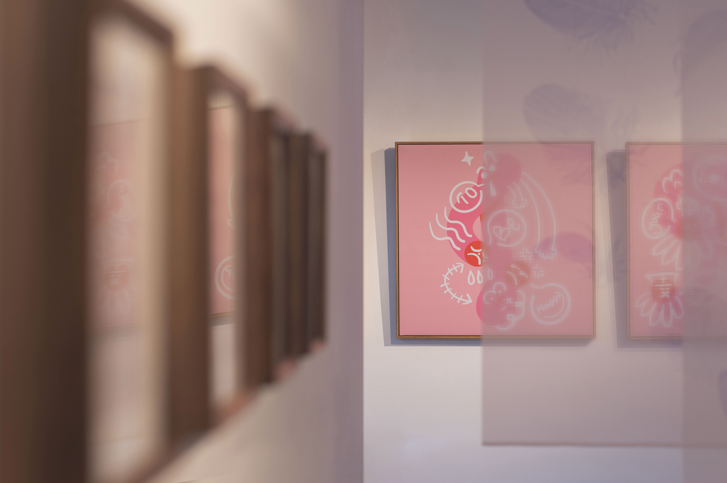
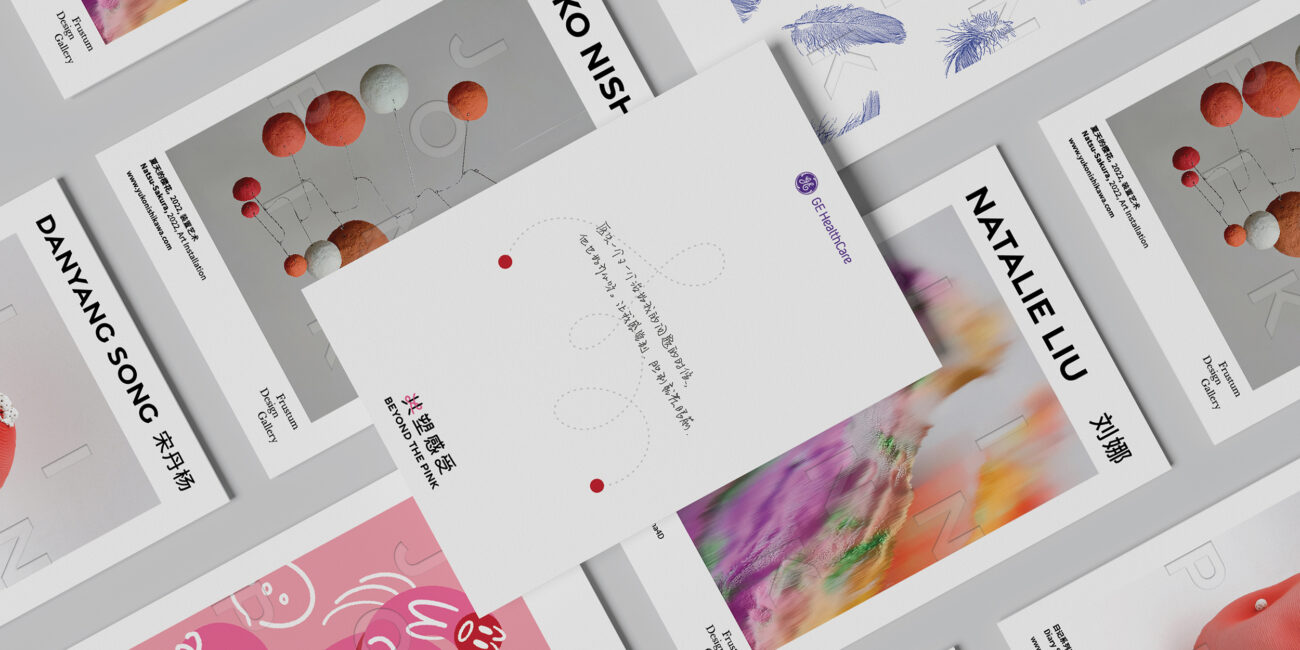
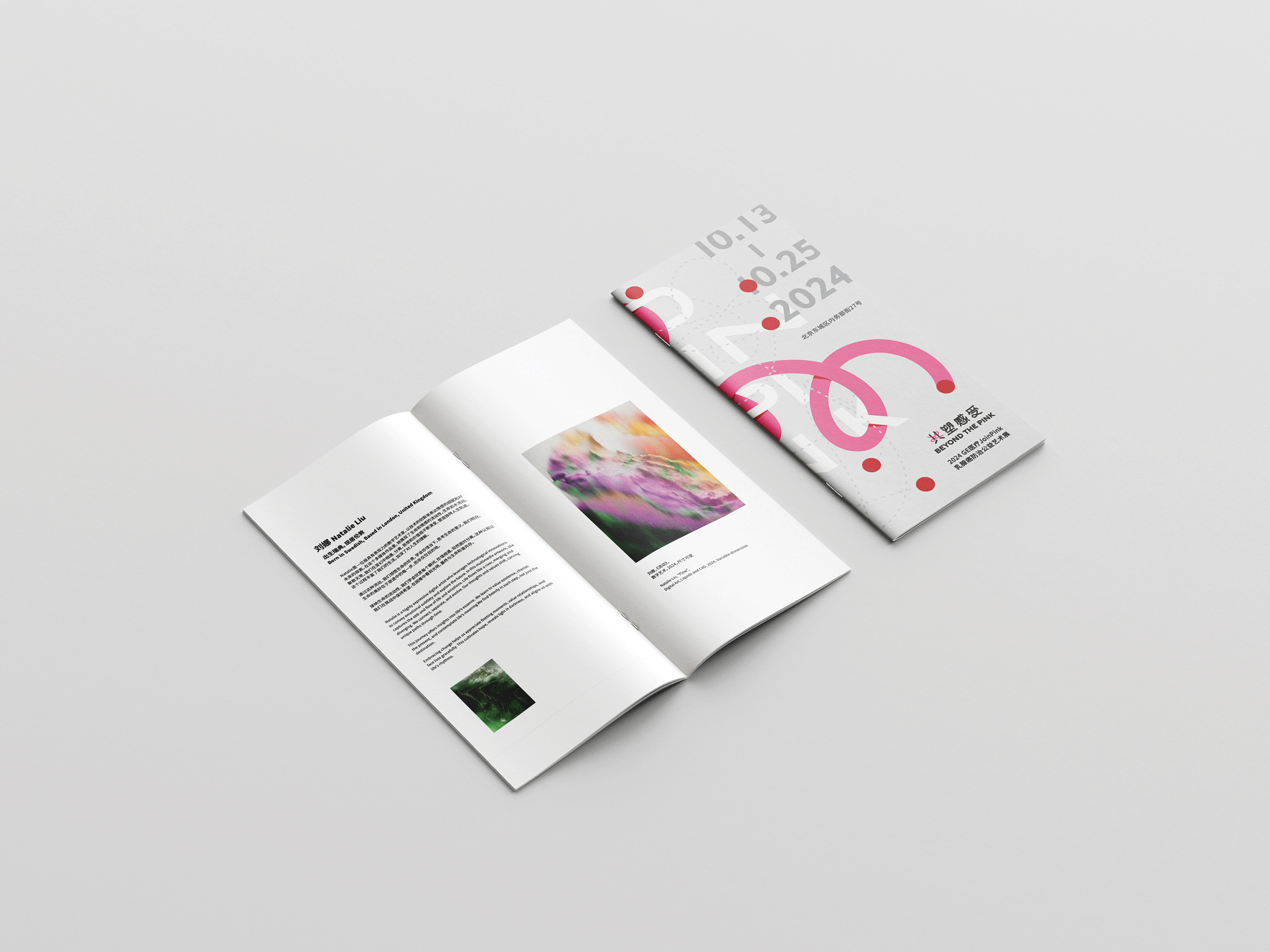
On each artist's postcard, a blind emboss of the Join Pink logotype has been carefully applied. By minimizing overt branding, this subtle mark creates a quiet unity across the diverse artworks, linking the collection together while preserving each artist’s individual expression.
Design Concept for the Educational Booklet
While the Join Pink campaign provided the foundation for the educational booklet, its content and visual design have transcended the campaign’s immediate timeframe. Instead, it marks a strategic attempt to reshape how medical information is communicated and experienced within the broader public healthcare environment.
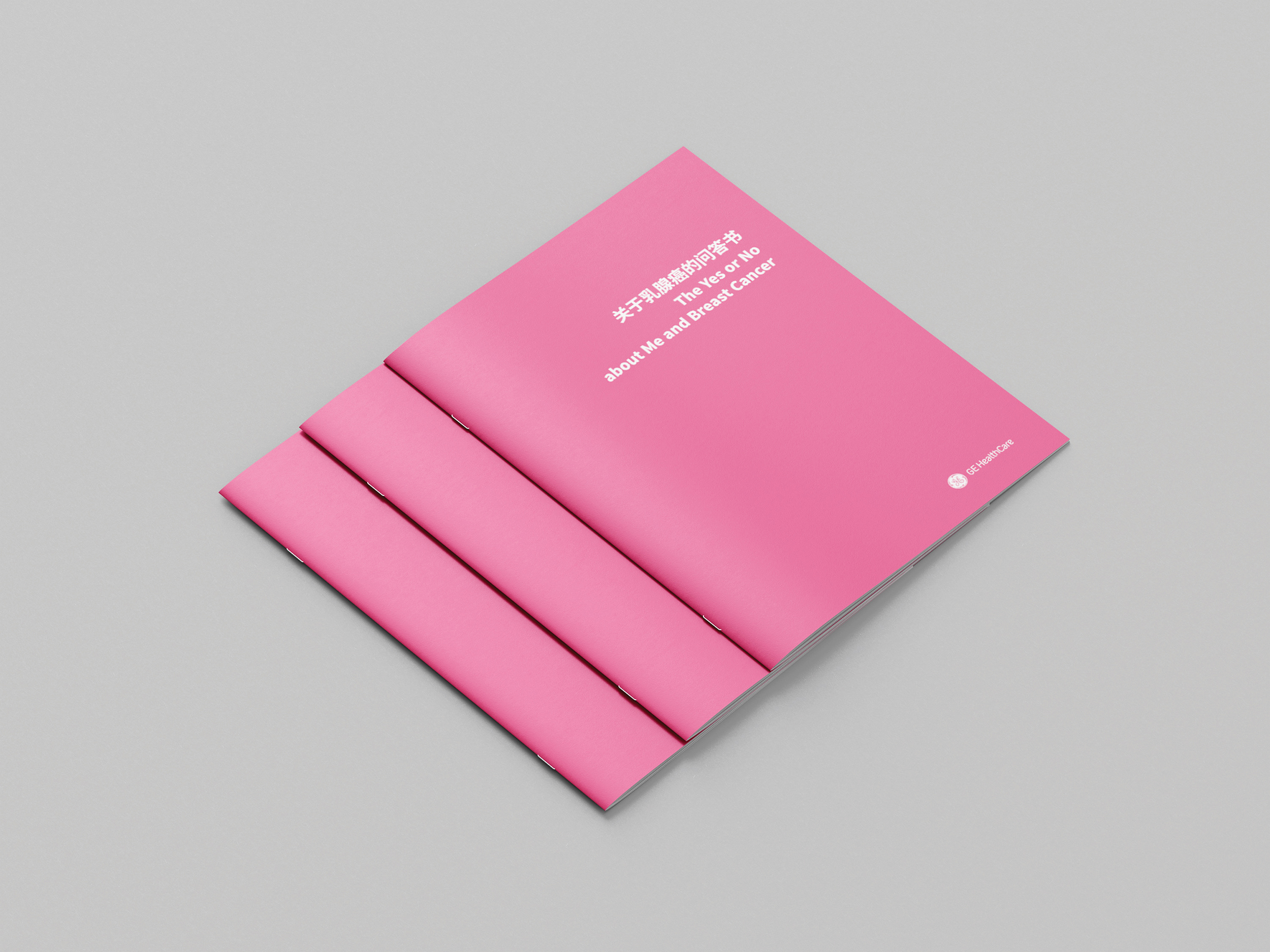
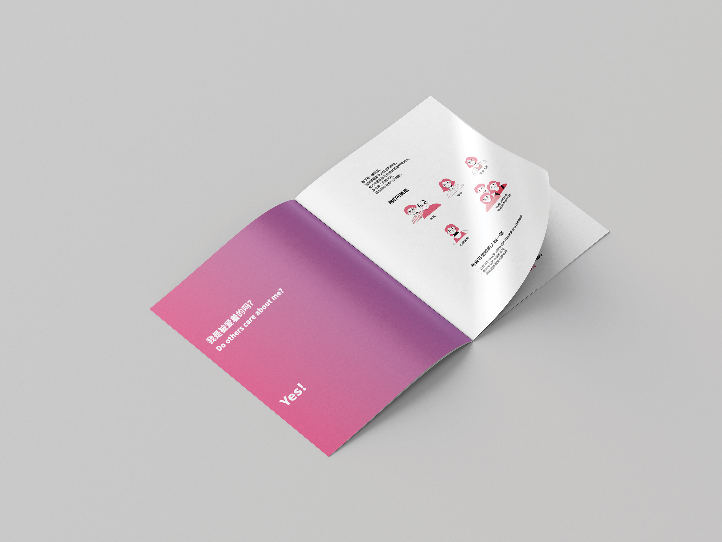
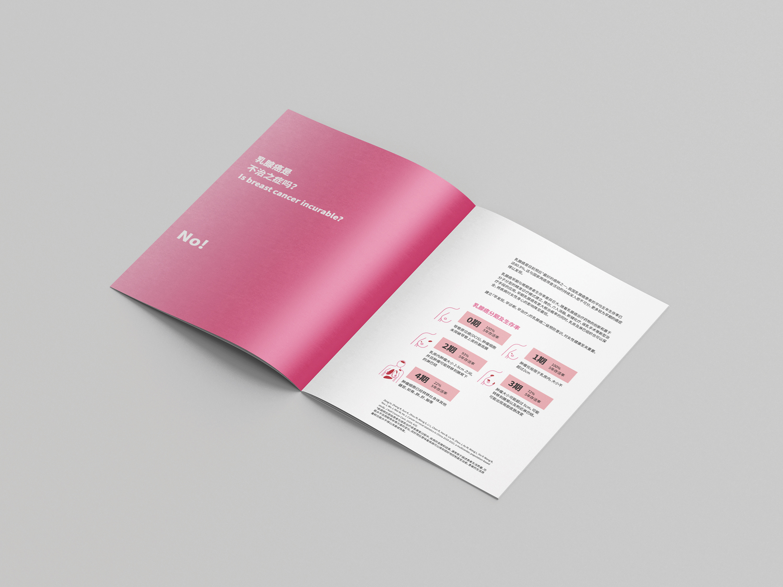
The educational booklet, titled "The Yes or No about Me and Breast Cancer", takes a bold step in moving away from traditional, often overwhelming, medical literature, offering a more approachable and engaging format. By using 10 essential questions to guide the reader through breast cancer awareness, the booklet simplifies complex medical information, turning it into a conversational journey. This format is designed to encourage self-care and early awareness, empowering readers to gain vital knowledge in a way that feels personal and accessible. Whether for their own benefit or the well-being of those around them, readers are invited to engage with the material without feeling overwhelmed.
Color Logic and Visual Design
Integral to the booklet's design is the use of a color gradient that symbolically represents the journey from awareness to action. It reflects a new way of thinking about healthcare communication—one that embraces fluidity and adaptability. The colors represent the evolution of knowledge: starting with initial awareness (pink) and flowing into deeper engagement and transformation.By moving beyond the confines of the campaign’s timeframe, the gradient reinforces the idea that healthcare information should always be in flux—constantly evolving as society’s understanding grows. This thoughtful color strategy does not just serve the campaign but is a visual reflection of the ongoing journey toward greater empathy and collective action in healthcare.The booklet, with its timeless design, reflects a transformative shift in how medical knowledge is shared: no longer isolated to clinical settings, but actively woven into the everyday experiences of individuals. It becomes a tool for changing the public healthcare environment, enabling broader access, understanding, and collaboration.
In developing this campaign, we engaged deeply with individuals from all walks of life—frontline healthcare workers, community volunteers, leading physicians, patients, and their families. Through their stories, breast cancer emerged not merely as a clinical condition but as a profoundly human experience, impacting individuals on physical, emotional, and social levels.
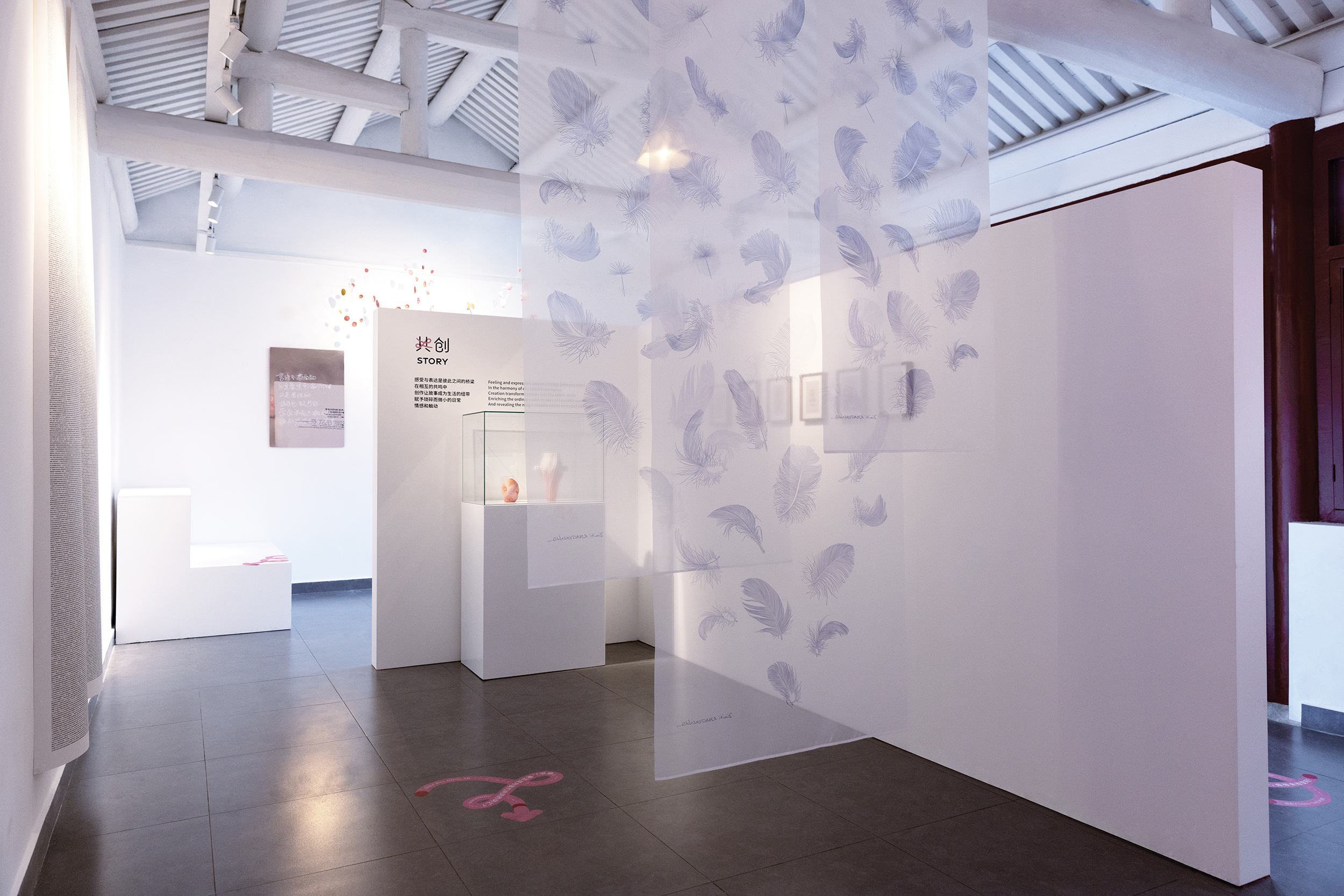
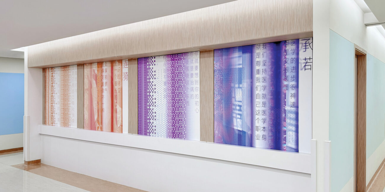
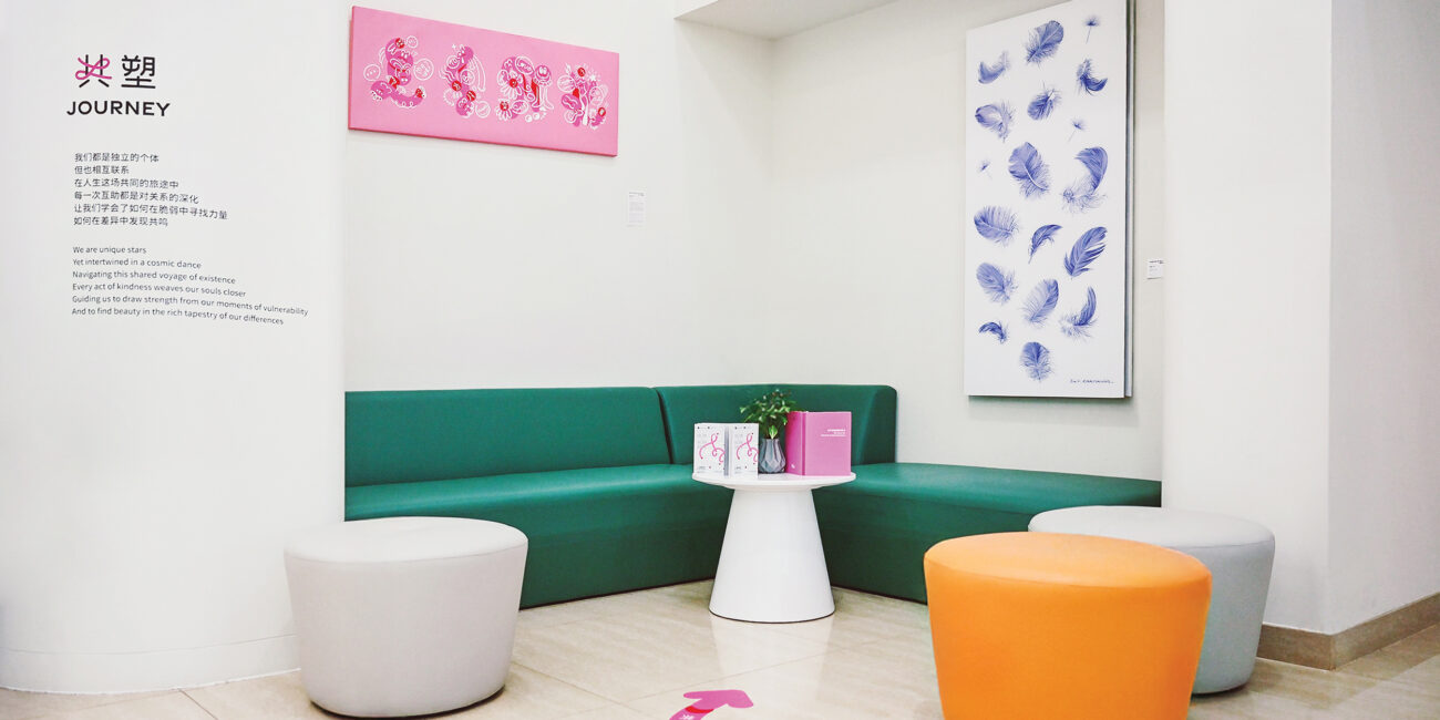
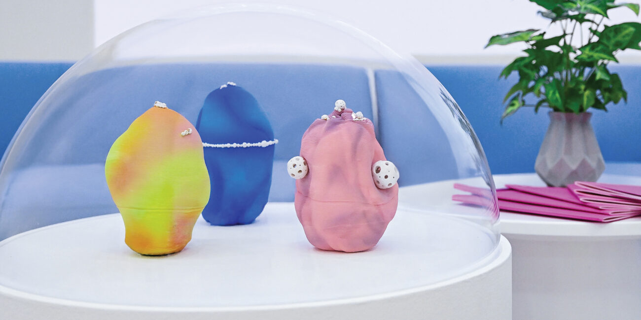
Simultaneously, we collaborated with artists from around the world, inviting them to interpret these narratives into immersive artistic experiences. Through exhibitions, these powerful stories are shared across public spaces, hospitals, and social platforms, making the realities of both patients and healthcare providers more visible, relatable, and emotionally resonant.
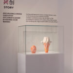
Art has a transformative presence in unexpected spaces: hospitals become galleries, stories materialize as sculptures, and public spaces evolve into stages of empathy. Each artwork pulses with the rhythm of real human experiences, breaking silences, challenging prejudices, and fostering new pathways to healing.
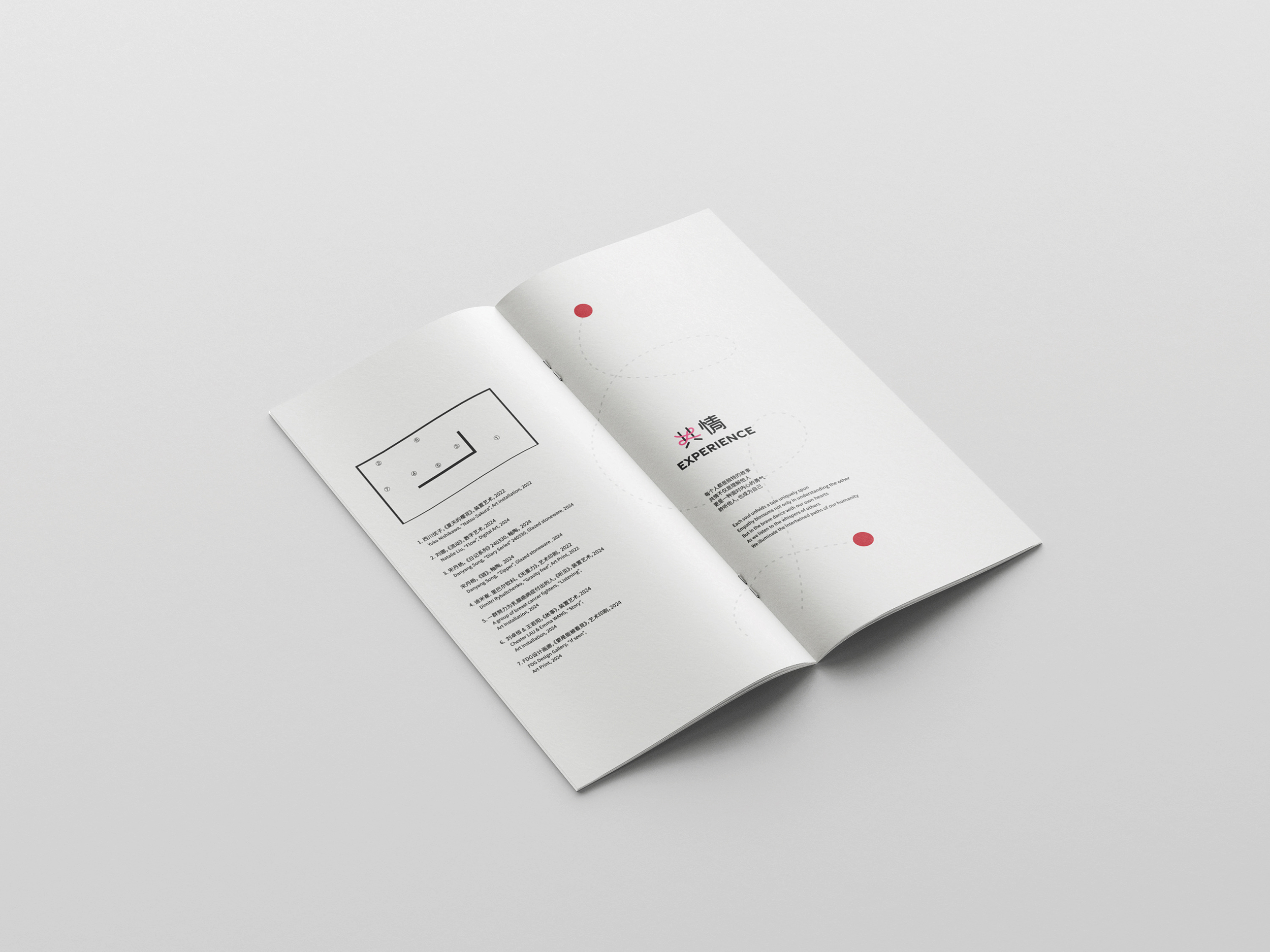
Experience Design and Narrative Structure
The Join Pink campaign in 2024 seeks to transform individual experiences—those of patients, healthcare workers, and doctors—into shared public resources. In crafting the campaign, we engaged a diverse range of voices—healthcare workers, community volunteers, doctors, patients, and their families. Their stories revealed that breast cancer is not just a clinical condition, but a deeply human experience that impacts individuals on physical, emotional, and social levels. These narratives were then reinterpreted by artists from around the world, transforming them into immersive artistic expressions.
The exhibition strategically integrates art into unexpected spaces: hospitals become galleries, personal stories take shape in sculptures, and public spaces transform into stages of empathy. Each piece of art resonates with real human experiences, breaking silences, challenging prejudices, and opening new pathways to healing. This approach not only supports the campaign’s core mission but also facilitates the transformation of individual experiences into a shared understanding, fostering collective awareness and inspiring action.
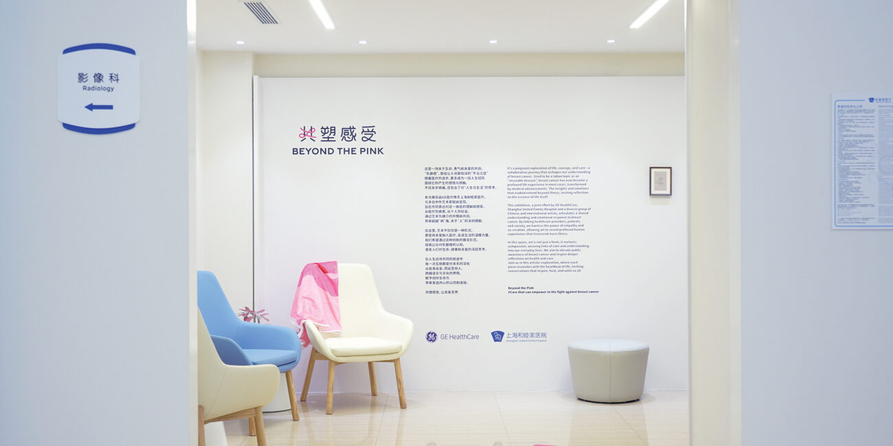
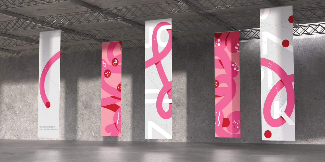
Hospital Space
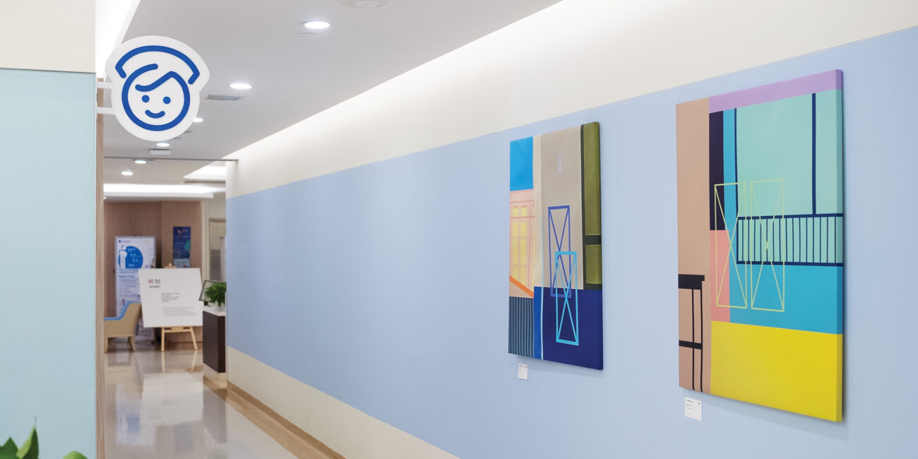
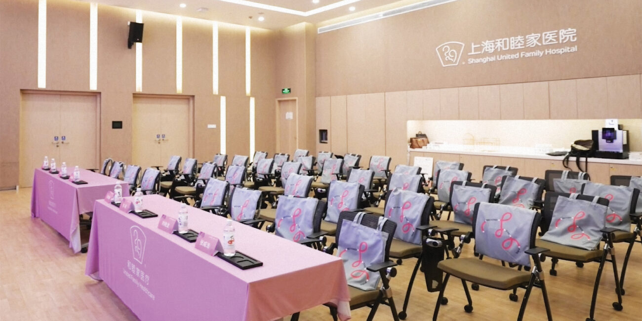
We brought the Join Pink art exhibition into hospitals, creating an environment where art fosters empathy and dialogue. The ambiance created by the artwork encourages patients and healthcare professionals to engage in more compassionate conversations. Patients feel empowered to openly share their emotions, while healthcare workers gain deeper insights into the psychological and emotional needs of their patients, enabling more personalized and compassionate care.
This initiative lays the foundation for a long-term, always-on approach to integrating art in hospitals, with the goal of continually evolving healthcare environments into spaces that prioritizeempathy, connection, and understanding. By embedding art into these settings, we aim to create an enduring transformation in the hospital experience, making it an ongoing part of the healthcare landscape.